Popis
Widget headerMAX je navržen tak, aby vylepšil přizpůsobení a použitelnost vašeho dashboardu Zabbix. Umožňuje uživatelům vytvářet vizuálně odlišné záhlaví sekcí a interaktivní tlačítka s odkazy na URL. Tyto funkce pomáhají zlepšit navigaci a organizaci, což usnadňuje strukturování dashboardu podle konkrétních potřeb monitorování.
S headerMAX-em mohou uživatelé plně přizpůsobit svá tlačítka a záhlaví výběrem z několika stylů písma, barev pozadí, velikostí textu a dalších možností designu. Tato úroveň přizpůsobení zajišťuje, že důležité části vyniknou, a zlepšuje přehlednost a efektivitu rozložení ovládacího panelu.
Dodatečně, možnost vytvořit tlačítka s odkazem na URL umožňuje rychlý přístup k externím zdrojům, zprávám nebo různým zobrazením dashboardu, čímž se zkracuje čas strávený hledáním důležitých informací. Ať už se používá k kategorizaci sekcí, zvýraznění klíčových metrik nebo propojení s důležitými nástroji, HeaderMAX činí dashboard Zabbix uživatelsky přívětivějším, vizuálně atraktivnějším a funkčně přizpůsobivějším.
Instalace
Nastavení úložiště na serveru
Připojte se k frontendovému serveru Zabbix (proveďte na všech frontendových uzlech) přes SSH.
Přejděte do složky /modules (obvykle se nachází v /usr/share/zabbix/ nebo /usr/share/zabbix/ui/)
cd /usr/share/zabbix/modules/Klonujte repozitář na svůj server
#FREE
git clone https://git.initmax.cz/initMAX-Public/Zabbix-UI-Widgets-headerMAX.git

#PRO
git clone https://git:<<YOUR-TOKEN>>@git.initmax.cz/initMAX-Public/Zabbix-UI-Widgets-headerMAX-PRO.git
Změňte vlastnictví adresáře na uživatele, pod kterým běží vaše rozhraní Zabbix, pomocí příkazu chown (cat /etc/passwd pro zjištění, který uživatel byl vytvořen během instalace), několik příkladů:
chown -R nginx:nginx ./Zabbix-UI-Widgets-headerMAX*chown -R apache:apache ./Zabbix-UI-Widgets-headerMAX*chown -R www-data:www-data ./Zabbix-UI-Widgets-headerMAX*Přejděte do nově vytvořeného adresáře, vyberte dostupné větve a vyberte tu správnou pro vaši verzi Zabbixu:
cd Zabbix-UI-Widgets-headerMAX*

# show all available remote branches
git branch -r
#  origin/HEAD -> origin/production/7.0
#  origin/production/6.2
#  origin/production/7.0
#  origin/production/7.4

# switch to the correct branch for your Zabbix version, for example:
git checkout -b production/7.0-free origin/production/7.0-free

# verify
git branch
Inicializace frontendového modulu
Přejděte do nabídky frontendu Zabbixu a vyberte: Administration → General → Modules
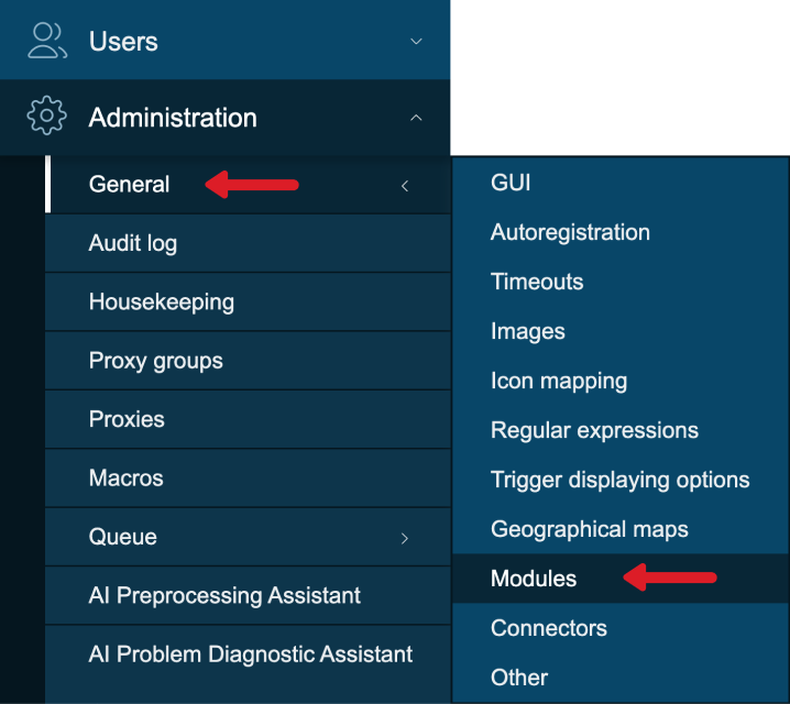
Použijte tlačítko ‘Scan directory’ v horní části.
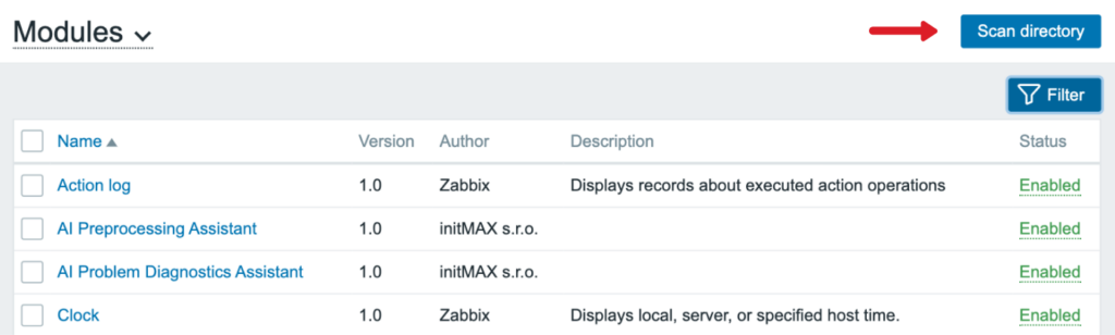
Povolit nově objevený modul/widget
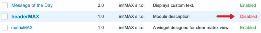
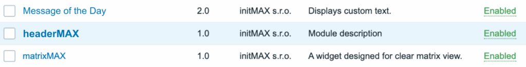
Modul je k dispozici v nabídce
Konfigurace
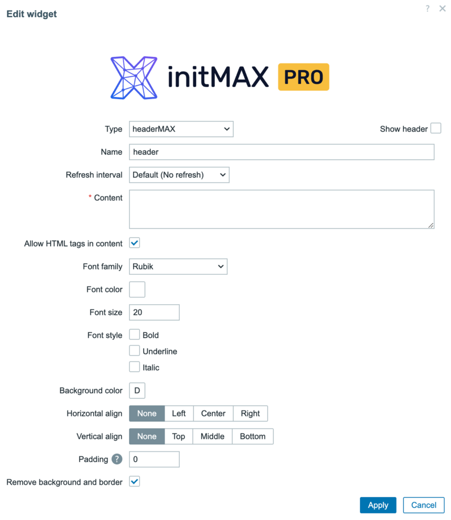
| Pole | Popis |
| Content | Hlavní text nebo obsah HTML, který se má zobrazit v widgetu záhlaví. |
| Allow HTML tags in content | Umožňuje vykreslení základních HTML tagů (např. <b>, <i>, <br>) v obsahu. |
| Font family | Nastaví písmo použité pro text (např. Rubik, Arial atd.). |
| Font color | Definuje barvu textu pomocí výběru barvy nebo hexadecimálního kódu. |
| Font size | Nastavuje velikost textu v pixelech. |
| Font style | Možnosti pro tučné, podtržené nebo kurzívní zobrazení textu. |
| Background color | Nastaví barvu pozadí oblasti záhlaví. |
| Horizontal aligh | Zarovná obsah vodorovně: None, Left, Center, or Right. |
| Vertical align | Zarovná obsah vertikálně: None, Top, Middle, or Bottom. |
| Padding | Nastaví odsazení (mezera) kolem obsahu v pixelech. |
| Remove background and border | Odstraní barvu pozadí a ohraničení, aby byl widget zcela průhledný. |
Příklady použití
Zde je několik příkladů, jak můžete widget HeaderMAX použít
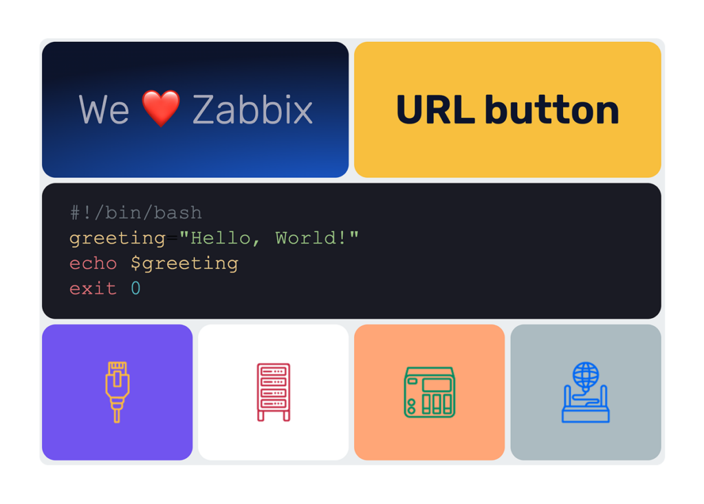
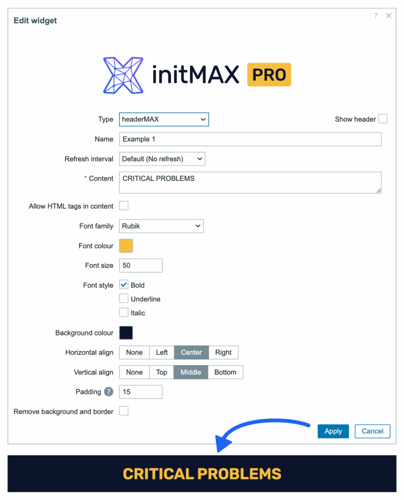
Příklad 1 – Prvek záhlaví na řídicím panelu
Používá pouze standardní funkce bez HTML tagů – k dispozici v bezplatné verzi widgetu.
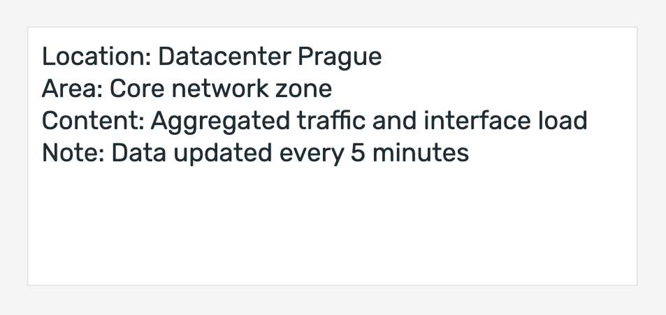
Příklad 2 – Informační blok
Widget HeaderMAX lze také použít k zobrazení jasných a stručných kontextových informací bez jakéhokoli stylování nebo HTML.
Níže uvedený příklad používá pouze prostý text, takže je kompatibilní s bezplatnou verzí widgetu.
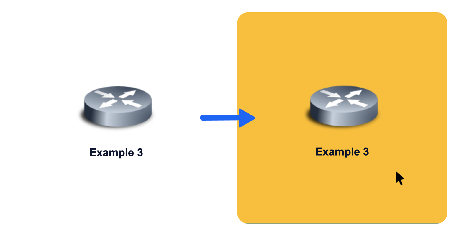
Příklad 3 – Interaktivní tlačítko pro navigaci v ovládacím panelu (funkce pouze v PRO verzi)
Pomocí HTML může widget HeaderMAX fungovat jako vlastní navigační tlačítko, které odkazuje na jiný dashboard.
To je užitečné zejména pro vytváření vizuálních nabídek, přehledů sekcí nebo panelů pro rychlý přístup přímo v rozložení řídicího panelu. Díky stylům aplikovaným přímo v HTML můžete ovládat rozložení, odsazení, ikony a chování při najetí kurzorem myši tak, aby vyhovovaly vašim požadavkům na branding a uživatelské rozhraní.
Níže uvedený příklad obsahuje klikatelnou ikonu a název, stylizované jako dlaždice se zaoblenými rohy a přechodem barvy pozadí při najetí kurzorem myši.
Poznámka: Tento příklad vyžaduje, aby byl v nastavení widgetu povolen HTML kód, a může používat vlastní ikony Zabbixu (např. z imgstore.php).
Příklad kódu
<div style="
    width: 100%;
    height: 100%;
    background-color: white;
    border-radius: 20px;
    overflow: hidden;
    box-sizing: border-box;
    transition: background-color 0.3s ease;">

    <!-- MANUAL: Link to target dashboard -->
    <a href="zabbix.php?action=dashboard.view&dashboardid=1"
       style="
       text-decoration: none;
       display: flex;
       flex-direction: column;
       justify-content: space-between;
       width: 100%;
       height: 100%;
       padding: 120px;
       box-sizing: border-box;
       transition: background-color 0.3s ease;"
       onmouseover="this.parentNode.style.backgroundColor='#f7be00';"
       onmouseout="this.parentNode.style.backgroundColor='white';">

        <div style="
        flex-grow: 1;
        display: flex;
        justify-content: center;
        align-items: center;">
            <!-- MANUAL: Icon source and alt text -->
            <img src="imgstore.php?iconid=127"
                 alt="Dashboard icon"
                 height="110"
                 style="
                 max-width: 100%;
                 object-fit: contain;">
        </div>

        <!-- MANUAL: Tile label -->
        <p style="
        color: #0D142D;
        font-weight: bold;
        margin: 10px 0 0;
        text-align: center;
        line-height: 1.2;">Network Overview</p>

    </a>
</div>
Kde to seženu?
Pokud vás tento widget zaujal, najdete ho v našem e-shopu. Tam se dozvíte více o dostupných verzích a o tom, jak produkt získat.